AthleteMonitoring Health Analytics simplifies injury and illness data visualization and epidemiological reporting.
To open the dashboard, select teams and athletes, open the Analytics menu and Health tab. Then, select the period of your choice and press the refresh button. Graphs are automatically displayed in each tab.
To remove tabs from the dashboard, click Settings and deselect the tabs you do not need.
The Overview tab
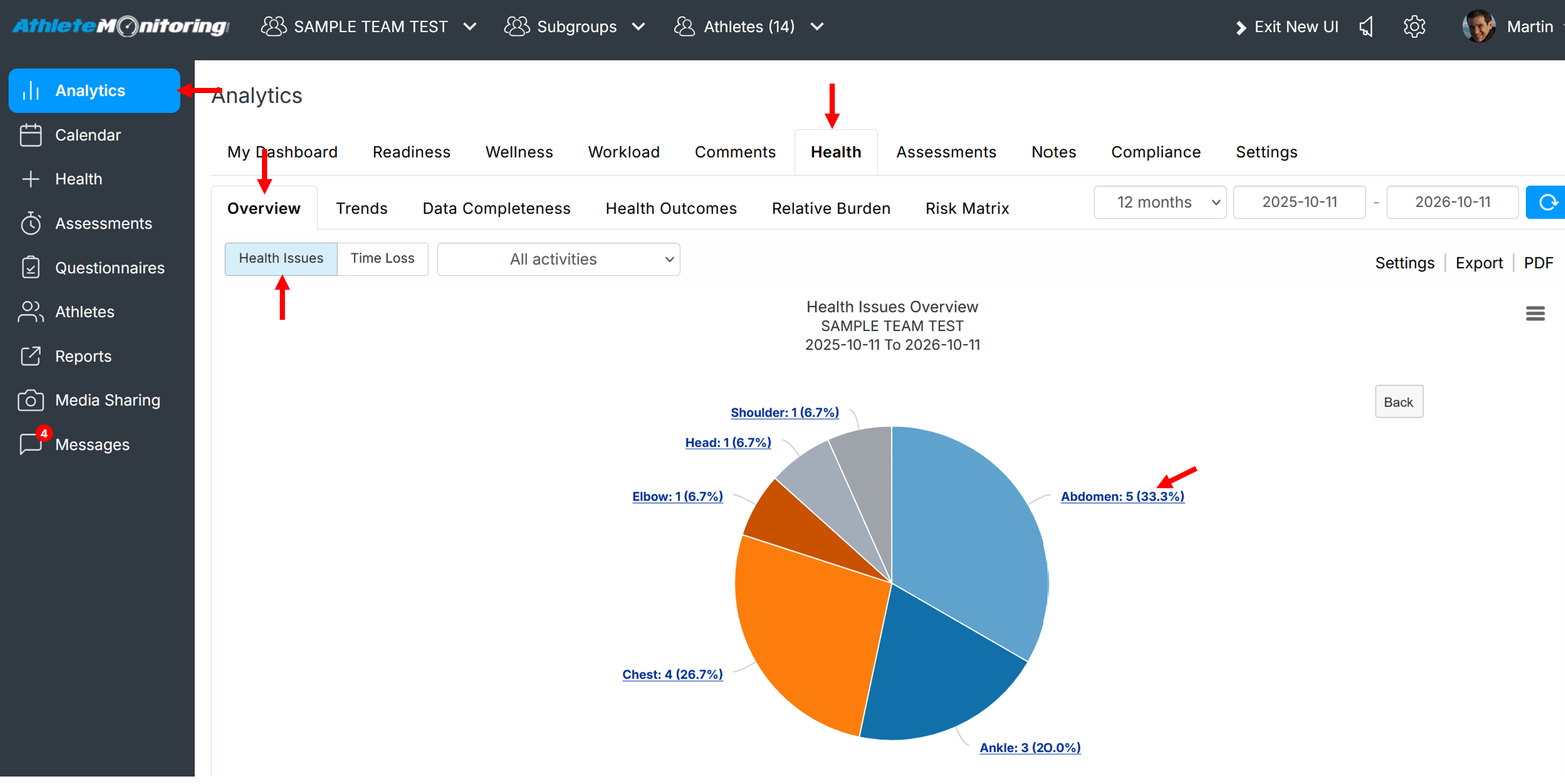
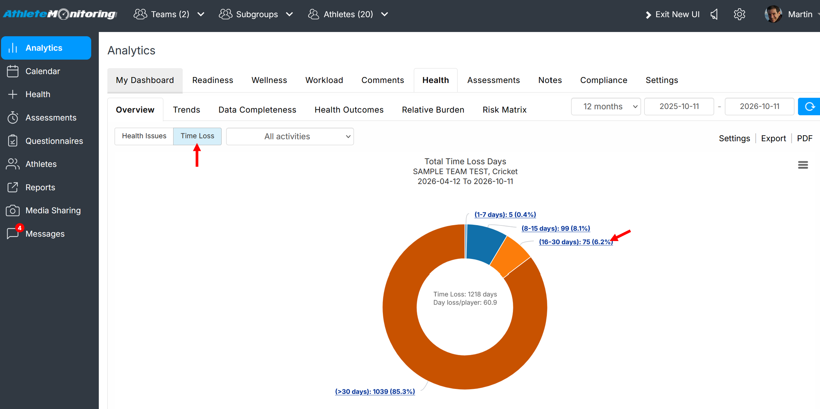
This tab includes an overview of all health problems and time loss recorded during the selected period. Click on the displayed links to expand the graphs and display more details.
Overview of reported health problems by activity, type of health problem, body location and diagnosis
Overview of reported time-loss by activity, type of health problem, body location and diagnosis
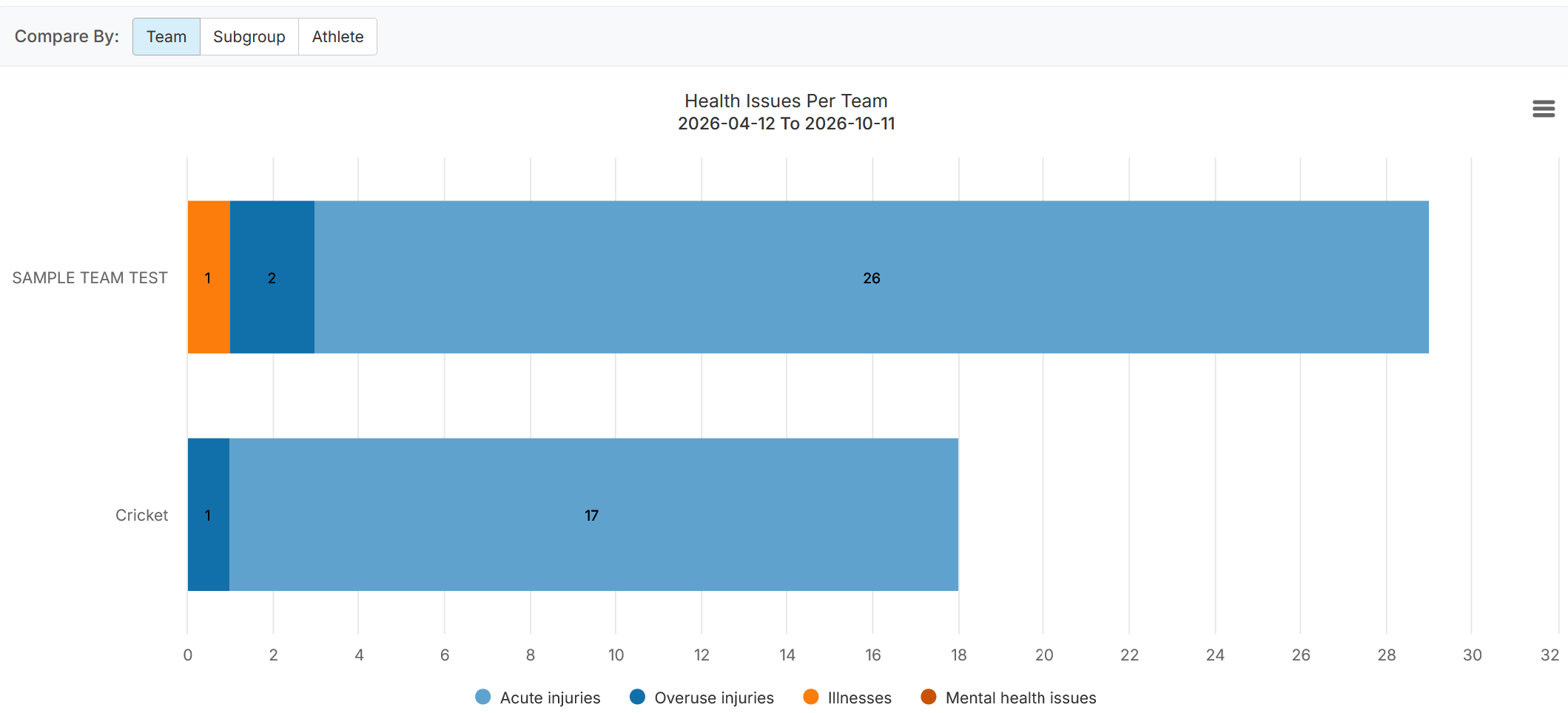
Inter team, subgroup, athlete comparison of type of health problem
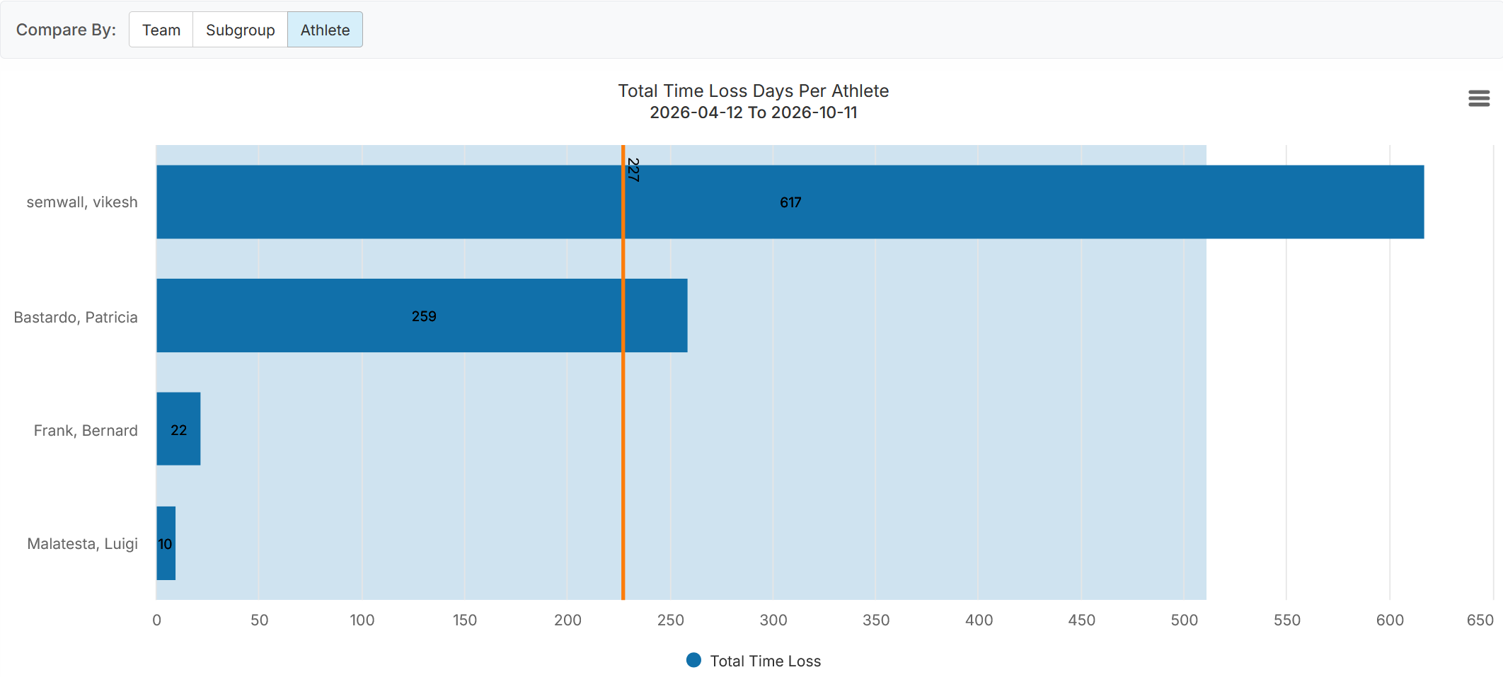
Inter team, subgroup, athlete comparison of time loss
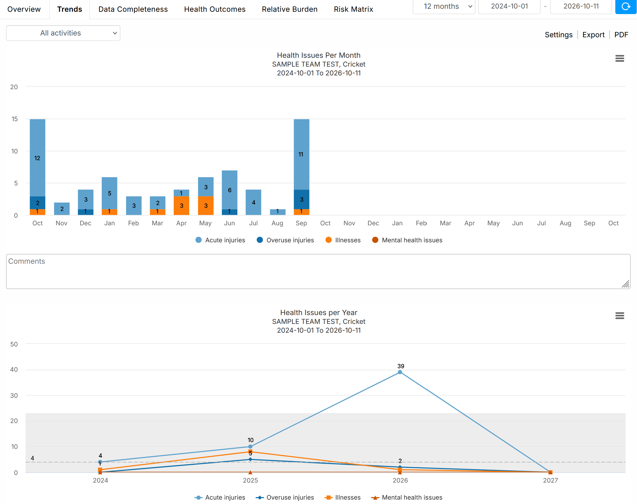
Monthly and Yearly Trends
Data completeness
This graph illustrates the number of weekly OSTRC questionnaires sent to the selected athletes (Invitations) and the number of completed questionnaires (Responses).

Response & diagnosis rates
This graph illustrates the number of weekly OSTRC questionnaires completed by athletes (Response rate), and the percentage of health problems diagnosed by health practitioners (Diagnosis rate).

Health outcomes (incidence & prevalence of health problems)
The first graph illustrates overall and weekly incidence of health problems (new cases/athlete/year). Substantial problems are those that caused time loss.
The second graph illustrates overall and weekly prevalence of health problems (athletes with health problems at any given time).
The data table under the graph includes detailed statistics. Incidence calculation method can be changed by selecting a different option in the dropdown list.


Relative burden
This graph illustrates the relative percentage of each type of health problem (acute injury, overuse injury, illness). Click on each bar to visualize detailed locations and diagnoses.
The data table presents severity statistics using the traditional method (time loss) and the OSTRC method (severity score calculated from the OSTRC questionnaire).

Risk Matrix
The Risk Matrix illustrates the burden of selected health problems based on of time loss days, or the OSTRC's questionnaire severity scores, and activities (based on selected options). The darker the yellow, the greater the burden. The vertical and horizontal error bars represent 95% confidence intervals (CIs).
Items can be removed from the graph by clicking on their names, in the legend under the graph.
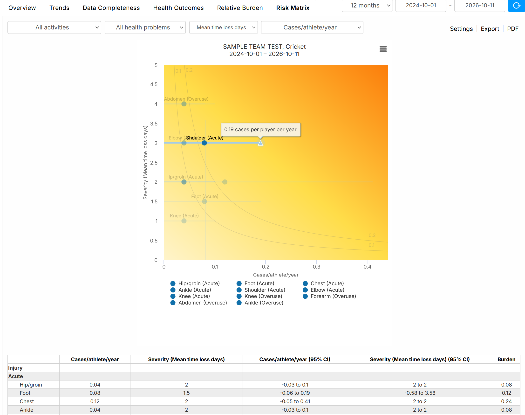
The Burden column shows the incidence x severity score.
Severity is calculated as the cumulative severity score the case. For example, if you have a case with weekly severity scores of 25, 50, 50, 25 and 10 for five subsequent weeks, the cumulative severity score for the case is 160.
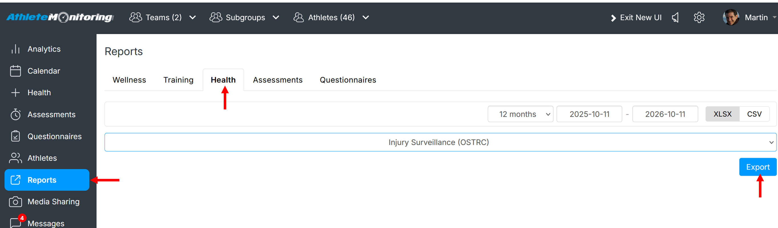
To export raw data in CSV or Excel format, click the Reports menu, open the Health tab, select a date range, the report to export and click Export.